
Creating responsive layouts is critical to user experience (UX) when building software applications. All user interface (UI) components—navigation, lists, forms, grids—must adapt to various screen sizes, device orientations, font sizes, user themes, accessibility needs, and more. Today, we’ll focus on creating thoughtfully designed grid interfaces that address all of these needs.

A grid interface is best suited for presenting small bursts of text or graphical information to a user. A long list of textual information is more appropriately displayed using a table and provides a better UX for sorting and scanning information. Grids can be useful for displaying product catalogs, image galleries, contact cards, and data that needs brought to a user's attention.
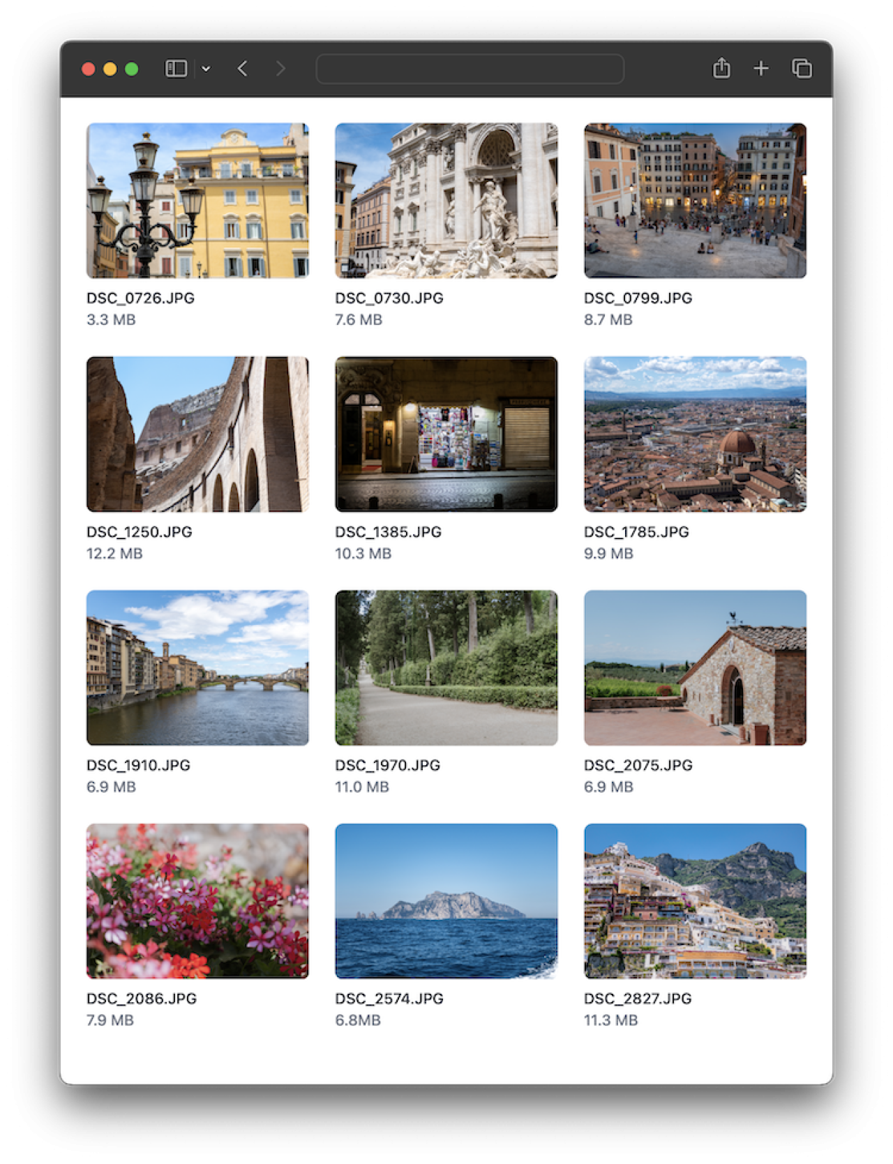
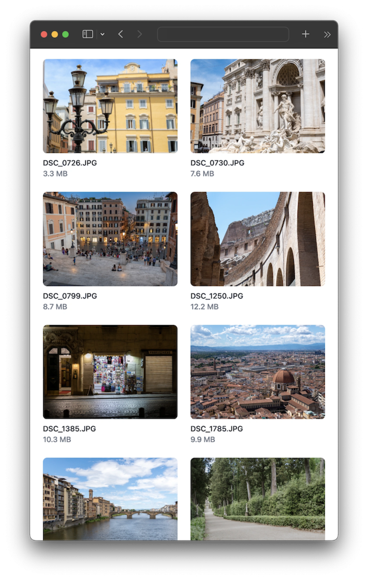
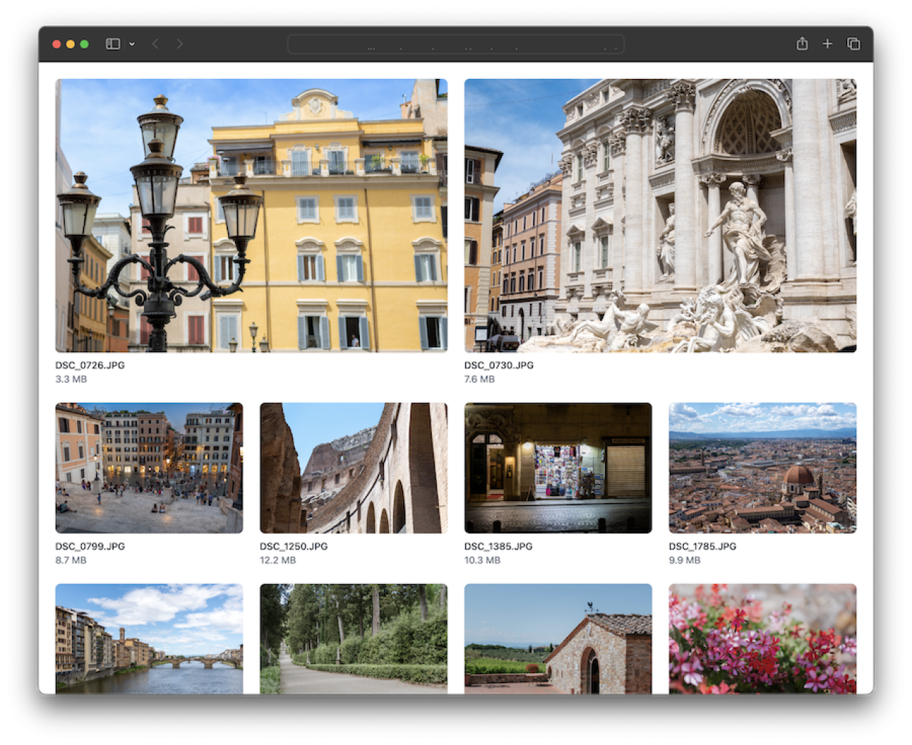
The grids should be responsive to account for varying screen sizes by altering the number of columns displayed without crowding the information shown.
By using a CSS framework, such as Tailwind CSS, grid interfaces can be easily achieved by applying just a couple of classes to an element. Responsive breakpoints should be included for adjusting the number of columns displayed on smaller screens.
<ul role="list" class="grid grid-cols-2 sm:grid-cols-3 lg:grid-cols-4 gap-6">
    ...
</ul>

// The underlying CSS that is generated
<style>
.grid {
  display: grid;
}

.grid-cols-2 {
  grid-template-columns: repeat(2, minmax(0, 1fr));
}

.gap-6 {
  gap: 1.5rem;
}

@media (min-width: 640px) {
  .sm\:grid-cols-3 {
    grid-template-columns: repeat(3, minmax(0, 1fr));
  }
}

@media (min-width: 1024px) {
  .lg\:grid-cols-4 {
    grid-template-columns: repeat(4, minmax(0, 1fr));
  }
}
</style>
To emphasize certain content or allow more space for larger elements, items can be set to span multiple columns. This is a good way to build well-structured layouts and have content flow among different-sized screens. The grid's flow can also be defined to control if content should flow horizontally or vertically. You may want to adjust the flow differently for various breakpoints to maintain a consistent, logical order of the content.
<ul role="list" class="grid grid-cols-2 sm:grid-cols-3 lg:grid-cols-4 gap-6">
  <li class="col-span-2">...</li>
  <li class="col-span-2">...</li>
  <li>...</li>
  ...
</ul>
Conclusion
Grid lists are a design pattern that provides structure while allowing for responsive content flow across multiple screen sizes. The majority of the web applications we build incorporate a gridded display to present information in a carefully designed way no matter the device. Do you have an idea for a web application or web portal for your business that would benefit from a modern, responsive design? Contact us to help you get started today!

