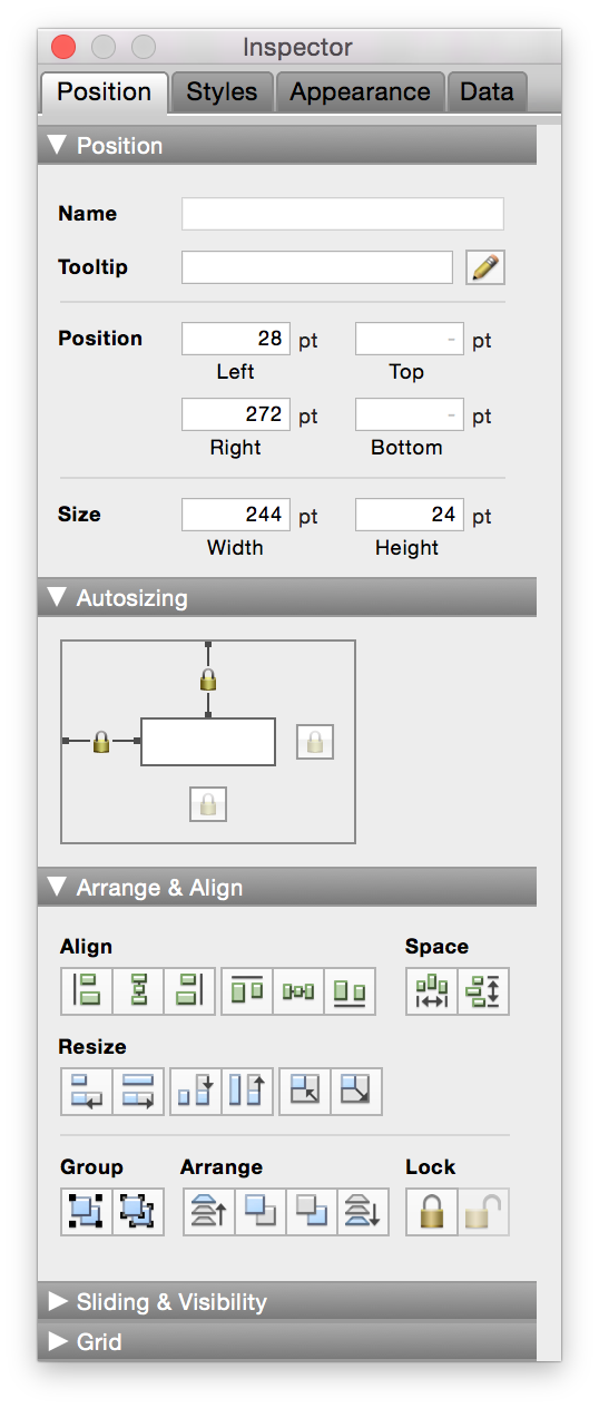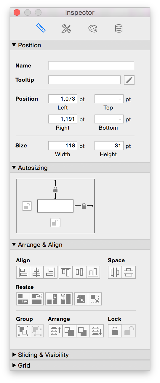
The FileMaker platform is a constantly evolving and improving ecosystem. The latest version of FileMaker has overhauled the user interface in a number of ways. The FileMaker application UI is extremely important because it is the backdrop of every FileMaker app. This round of updates increases the user experience with visual clarity, less text and visual noise on screen, more intuitive icons, and greater consistency of color.
Let's take a deeper look:
https://www.youtube.com/watch?v=XLhahiAPEDM&feature=youtu.be
Refreshed Status Toolbar
The status toolbar is the most important interface element of FileMaker. Whether your app is on desktop, mobile, web, or all three, chances are the status toolbar is a heavily utilized element of both users and developers. FileMaker 15 really makes the buttons pop to ensure users can easily perform regular actions such as create, find, and delete. Here's a comparison:
FileMaker 14

FileMaker 15

Layout mode status toolbar has also increased readability with some terrific color choices:
FileMaker 14

FileMaker 15

Improved Inspector


One controversial change is the removal of layout mode’s inspector tab names, in favor of icons and accompanying tooltips. These icons are relatively ambiguous, however, I would argue it is a change for the better. My reasoning is that the tab names were not clearly defined in the first place. I often know which tab a feature is located under by simply recalling first, second, third, or fourth tab. For example, Styles tab has all styling information… except that styles can also be managed from the appearance tab. And the data tab holds the field formatting display options, which directly affect the appearance of a field. The categories are good, but remain intermingled enough to require a bit of memorization. FileMaker 15 embraces this with flat icons and reduces the visual noise by removing text that hardly mattered in the first place. We’ve all already memorized the tab locations, so this change doesn’t take long to get used to.
A welcome refresh is the removal of the sushi bar of vague colors in the "Arrange & Align" section. FileMaker 15 replaces the skeuomorphic images with modern flat icons.
Another change to the inspector is the unifying effect of knocking back the section divider darkness. Now, these labels are no longer fighting to be the most prominent element even though they are the least referenced.
Updates to the inspector might take a little getting used to for seasoned developers, but from my own experience, it doesn't take long to appreciate the increased ease of use.
FileMaker WebDirect and Go Updates
The status toolbar for WebDirect as well as Go both received a minor update to the icon terminology. The most noticeable one of these is updating the dropdown menu to be an arrow in place of the old, rather vague, folder icon:
![]()
This should help the ease of use for all mobile users.
Conclusion
This version of FileMaker holds a number of visual updates to the application. These will help any custom app to look more sleek and modern. If you'd like assistance taking advantage of FileMaker 15's new features, contact us.
Did you know we are an authorized reseller for Claris FileMaker Licensing?
Contact us to discuss upgrading your Claris FileMaker software.


