FileMaker 13 introduced many new features, including a number of very useful enhancements to the relationship graph, none of which are included in the help file or release notes. This is rather surprising, as several of these improvements to the graph can really speed up development. Let's take a look at some of the new functionality.
Jump to Last Selected
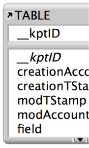
One of the most useful features is an update to how keystroke navigation works. In previous versions, pressing a letter key with nothing selected in the graph would jump the user to the first table occurrence (TO) in the graph that started with that letter. In FileMaker 13, instead of going to the first TO, it takes the user to the last selected TO when manage database was last saved. This is extremely useful for development, as you can now be working on a new relationship, save manage database, go off and do other things, and then quickly jump back to where you left off.
Move Cursor
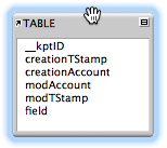
 When grabbing and moving TOs, the cursor in 13 has been updated to be a hand on Mac and a selection cross on Windows. This one may seem like a very minor update, however when viewing a zoomed out graph and trying to move selected TOs, it used to be really hard to tell when the mouse was directly on a TO, usually ending with the TOs becoming unselected when you mis-clicked into the background. Now the guesswork is removed and the user can easily move TOs around.
Selecting Table Occurrences
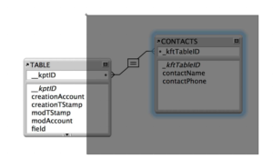
 Selection in the relationship graph is now consistent with how layout mode works. The selection box from clicking and dragging the mouse cursor now selects every TO the box touches, instead of only ones fully enclosed by the box. Holding down command (CTRL on Windows) and dragging will select the TOs fully enclosed by the box. Additionally, the color has been updated to be a blue halo around selected TOs, rather than the orange it used to be. A minor change, but it helps the application feel more consistent, as selected objects in layout mode are also highlighted blue.
Zoom
In the new relationship graph, you can now zoom in further than the default size. Previously you could only zoom out to see an overview. This adds some welcome flexibility, and will help when selecting those thin relationship lines.
Conclusion
The updates to the relationship graph in FileMaker 13 make development easier and faster, whether the system has 5 TOs or 500. We appreciate that FileMaker, Inc. threw in these little updates that help save time and enhance the usability of the graph. As if the new web-based admin console, custom themes and popover buttons weren’t already enough reasons to love FileMaker 13, these updates to the graph just give us more.
Did you know we are an authorized reseller for Claris FileMaker Licensing?
Contact us to discuss upgrading your Claris FileMaker software.


